I have conducted multiple usability testings on VISA websites and mobile apps. I designed research protocols, created testing plans, recruited participants, facilitated usability testings, analyzed the data, wrote the reports and presented to the clients. Usability testing for prepaid card responsive website is one of them.
Background: A number of people still do not have a bank account, but they need to use a prepaid card to get their salary or use it online. Some other people who have a bank account use a prepaid card to help gain control of their finances or give it to their children as allowance. VISA product team asked our UX team to see if the emerging prepaid card platform worked for users.
Research strategy and preparation: Since the prototype was ready to test, I decided to conduct usability testing for its mobile site and desktop site using prepaid cards we made up. In addition, I created the testing plan, designed a questionnaire using Qualtrics.com to screen out unqualified participants, and scheduled qualified participants for this project.
Testing method: Think aloud
Samples of main findings:
- Successful task completion rate

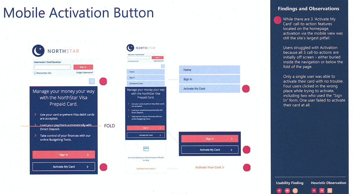
- Activation card function is initially off screen (see following picture as an example) on mobile site.
- Users are confused with actual balance and available balance.
Samples of design recommendations:
- Move activation button to the top of the screen (see following picture as an example).
- Move the explanation of the terminology onto the screen or rephrase the terms.

Result: The product team was very satisfied with our research. They followed our design recommendations. After finishing this project, they offered another project for us to study.